HealthPartners – Enhancing UX Through Content
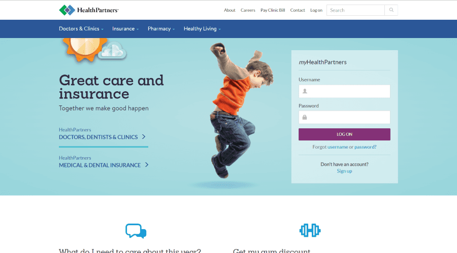
For six years, I had the privilege of managing and refining the digital presence of HealthPartners, an organization serving over 1.8 million members. The public-facing website was an important resource for members and non-members alike, connecting people to care, tools, and resources they needed to live healthier lives. The team I was a part of was filled with skilled UX designers, who I worked closely with to create a better experience for members and patients.
Web & Digital
·
8 min read
When I first joined HealthPartners, the website was functional but far from optimal. Content was scattered, stakeholder needs were siloed, and there was no cohesive strategy for growth or engagement. The team I was on saw an opportunity to transform the site into a streamlined, intuitive, and user-focused experience that reflected HealthPartners' commitment to care and innovation.
Building a Foundation for Collaboration
From the outset, we established a process of regular collaboration with stakeholders across the organization. Departments ranging from member services to medical specialties relied on the website to communicate with their audiences. My role involved translating their needs into clear, actionable updates within our CMS. I worked closely with each team to ensure their copy was accurate, engaging, and aligned with organizational goals.
To measure the effectiveness of our efforts, I implemented performance reporting using Google Analytics. I tracked key metrics such as user behavior, time spent on pages, and conversion rates. These insights informed our strategy, allowing us to iterate and optimize as we went.
Planning the Redesign
In my later years at HealthPartners, I played an integral role in the website redesign. It was clear that while the site served its purpose, there was significant room for improvement in usability, content hierarchy, and overall design.
The redesign process began with a deep dive into content audits. I meticulously reviewed every page to evaluate relevance, accuracy, and performance. This effort laid the groundwork for creating a more streamlined and intuitive content structure. I developed recommendations for hierarchy and navigation, ensuring that users could find what they needed quickly and easily.
Research and Testing for Results
A critical component of the redesign involved understanding our audience and competitors. I conducted comprehensive competitor research to benchmark HealthPartners against similar organizations and identify opportunities for differentiation. Armed with these insights, I created editorial calendars to guide the development of fresh, targeted content.
We also prioritized user feedback throughout the redesign process. By conducting user testing, we gained valuable insights into how real members interacted with the site. This informed design decisions, allowing us to refine elements such as menu structures, search functionality, and call-to-action placements.
A Site Built for the Future
The culmination of these efforts was a refreshed, modernized website that elevated the user experience while staying true to HealthPartners’ mission of providing exceptional care. Content was not only easier to navigate but also optimized for engagement and clarity. The new design supported HealthPartners' broader goals of improving access to information and services, fostering deeper connections with members, and driving measurable growth.
Lessons Learned
This experience taught me the power of collaboration and adaptability. By fostering strong relationships with stakeholders, listening to user feedback, and leaning on data-driven insights, we were able to create a website that truly worked for its audience.
Ultimately, my work at HealthPartners wasn’t just about maintaining a website—it was about creating a digital space that reflected the organization’s heart: a commitment to improving health and well-being for every person we served.

